Coursework, notes, and progress while attending NYU's Interactive Telecommunications Program (ITP)

Serial: p5 vs node

This week we experimented with passing serial from sensors through different programs, and using serial to control things on the web or in real life!

Troubleshooting

I initially couldn’t get p5 to list the available ports and couldn’t figure out why since I copied the code from the lab. I went back to the code from the synthesis examples to check, and these didn’t recognize my usb port either. I also tried switching to another usb port. Finally I figured out it was because the serial control program had been updated. Everything worked fine with p5 after I downloaded the new version!

It was a good opportunity to experiment with node, though I eventually got stuck when I went to interact with a webpage in the browser. I just used p5, but it would be nice to figure it out.

hating the p5 web editor

hating the p5 web editor

screen-shot-2016-10-16-at-8-16-56-pm

Using node

Serial events p5 versus node:

screen-shot-2016-10-16-at-8-21-13-pm

screen-shot-2016-10-16-at-8-22-10-pm


Business Cards

This week we learned about composition, and were tasked with creating a design for a personal business card. I do data analysis full-time, but I’ve been moving toward data visualization at ITP. I knew from our typography exercise that I wanted to use Raleway for the font. As an initial step, I printed out my name and information in a few different point sizes and weights. I hoped to get the process of analysis and visualization across, and to showcase a few different projects, but showing just one was plenty of work. There are many components of a good data visualization that don’t work well on a static and small business card, so I abstracted the elements to tell a story.

The final version:

final

final


In earlier sketches, I developed the “disorganized data” to “organized data” visualization, but I wanted it to relate to something real, meaningful, or something I’d at least worked on before. I explored the idea of using data from a map of NYC recycling I made last semester, or a project I had done on women’s representation in government. I moved away from the women-in-government idea after I didn’t find a good way to summarize the data (for now). There are 96 countries that have more women in their respective parliaments than the U.S. does!

firstdraft

My final idea was the connect the data on the front of the card to the community districts in NYC that I had mapped for the recycling project. The bars organize the community districts by borough. It seemed like too much to include words and numbers on the back, so instead I abstracted the outline from the base map, and included a link so curious people could check out the entire thing. The colors of the boroughs on the front correspond to the outline of the colors of the boroughs on the back. I used a diagonal line to take advantage of what we learned in class about composition: that the eye moves from the top left and the weakest portion is the bottom right. I extended the line to the back, hoping to convey that this is the logical 3rd portion, and that all the parts are related. Printing, folding, and securing the front and back with surface mount was another challenging part that resulted in some imperfect cards.

folded

Some good feedback I’ve gotten since showing the final product around is to add a QR code to the back that links to the map, or to outline each of the community districts in the borough color. They seem like good ideas to explore in a future version!

Analog Out labs

This week we worked with analog out, using it to control a servo motor and a small speaker. To create sound, we used the tone function and the pitches library.

I used a photocell as my variable resistor for servo motor control, but I also tried building my own FSR with velostat. I got normal readings before sewing everything together (with resistance varying depending on how close the probes are to one another) but then got really wild unpredictable readings when I tested it after.

test2 test1

I didn’t end up connecting it to my circuit because I wasn’t sure what value resistor to use. I wonder what happened?


Coffee/Beer/Carbs/Please don’t judge me

Color Hue Test

colorhuetest


Color palette of food/drink before and during ingestion

colorportrait_final

colorpalette

For the color palette of my life I chose to photograph everything I ate and drank for about 75 hours. I chose food and drink partially because I was concerned that this would end up being a project about my office environment, but largely because I’m somewhat fascinated with the phenomenon of people photographing food and presenting it on social media. Sometimes I do like looking at people’s food (I have instagram-searched dumplings, for example), but a lot of the time I find it unappetizing. Also, since people are performing on social media, the food they post is selected based on various criteria (deliciousness, trendiness, etc) depending on the person. I wonder what their diet might look like outside of the curated version they present to the world.

I wanted a full data set of everything I ate and drank, but since photographing my food before eating it isn’t part of my eating ritual, I usually remembered this project some (or several) bites in. For the purposes of the assignment, which is actually about color, I also eliminated some ‘duplicates’ (my second cup of coffee/water from the same mug). Creating the composite image made the sad sequence of take-out apparent, but was an interesting color study. In isolating the colors themselves, which are mostly brown-orange, I became a bit nauseated.

I don’t usually eat sour patch kids, but I thought it was interesting that this, the mango, and the tomato on my bagel were really the stand-out, brightest colors. I think this would look different at the beginning of the week, when I have more mental energy to devote to eating vegetables, or in the summer, when produce surrounds me more. I’m not particularly proud of my role as busy-metropolitan consumer in the mess that is American food culture. Perhaps this palette is another visualization of problems related to it.

While adopting the practice of photographing food, I went to see Ukeles’ Maintenance Art exhibit at the Queen’s museum and found these standard colors for glassphalt, the processed pieces of recycled glass that are added to asphalt. Inspired by the process of transformation that they represented, much like the consumption of food, I applied my color palate to an image of glassphalt.

glassphalt_colors

Standard glassphalt colors – I would like to research these more but google wasn’t a helpful start

final_abstract

I focused on a brown of which I think there were varying shades and tints in my diet, with small amounts of the brighter colors I ate.

Interaction Observations

Gym equipment

I hate cardio equipment but I have been exposed to it enough to have some assumptions about how it’s used. I thought their use would be interesting to observe because while I have a friend who literally train for marathons on treadmills and just watches TV, I’d never do either of these things even though I did track in high school and go running all the time. Anyway: I assumed most people would take advantage of these giant screens that are now installed to listen to music or watch T.V. or plan their workout. I figured my marathoner friend was an anomaly and probably most people would get bored after about 30 minutes.

I picked my own cardio spot with a good view of everyone’s screens and was surprised that multiple people had what looked like a track on their screens. Like simulating a track environment? I didn’t even realize this setting existed. No one was watching TV and some people were listening to music straight from their phones. A lot of people use this equipment just for walking, which seems SO boring. The walkers also spend the longest time on treadmills! I was just confused because it seems much more pleasant to me to walk around in normal clothing outside. People just starting out usually went with quick start and then checked out other options, or knew something specific they were after (a workout on the ‘track’) and did that.

I had a small sample of people that I observed, but everyone fell into a low-intensity category playing with their phone, or an intense-workout category where they were not really using other entertainment. Time spent on machine varied but maybe on average I had it right around 30 minutes. It was interesting to consider the Norman and Crawford readings because it seemed like there was a lot of functionality built into these entertainment monitors, but people weren’t really interested in most of the options.

The dishwasher at ITP

I just have to note that the system of signifiers (washing, dirty, clean) on the dishwasher must present a design opportunity, because the dishwasher clearly isn’t communicating its state. I also know I am not the only one who has opened the dishwasher while it was washing, because someone did not move the magnet to the washing square. One of my classmates the other day, after I opened it and noticed it was hot, joked “You are a human sensor.”

Digital In/Out & Analog In labs

This week we learned to read input from switches, variable resistors, or sensors connected to the digital and analog inputs on arduino and how to send digital signal out to control actuators.

digilab1

The first thing I did was build a circuit with a button and a pull down resistor to read digital (on/off) input from the button, depending on whether it was pushed down to complete the circuit. By connecting it to a digital pin, I could read this information and use it in my program. The next piece was to build two additional circuits with a resistor and LED, and connect each of those to their own digital pin. Then, with some conditional logic, I made one LED light up when the button wasn’t pressed, the other light up when it was pressed.

Next I tried reading analog values from a potentiometer and a force sensor to control the brightness of an LED. By connecting the LED to pin 9 on the arduino, which is a PWM (pulse width modulation) pin, you can simulate analog output which allows for this apparent dimming of the LED. Reading values from a potentiometer and any other variable resistor really aren’t so different.

Realizing that I had already played with analog output with the dimming LED, I wanted to go back to my reflective flower from last week and control it with a variable resistor instead. Since it’s a flower, it made sense that it would react to light, so I used a photoresistor. I had to skip ahead in the labs a little bit, since the motor needs a 9V power supply, and I wasn’t sure how to control the motor with the power supply and the arduino. The answer is: with a transistor! I used a PN2222 transistor (thank you, internet) to connect the analog out from the arduino to the circuit that controlled that power for the motor. My flower responds to light!

Some other issues are that the base isn’t so sturdy, so it works kind of like a spinning top. Also the motor takes a while to slow down, so playing with it you don’t sense an immediate change by lessening the amount of light available. I think it would be cool to hide the photoresistor within the flower somewhere, so that you can control the flower by interacting with it directly.

Typography & word as image

This week was a challenge since I started out knowing nothing about typography or illustrator, but I considered it a cool opportunity to analyze fonts I like and have used in the past without thinking about why, and a good chance to practice very useful software. I’ve had to choose fonts for web projects, so in addition to understanding these choices differently, I was also importing them for use in a very different environment (illustrator, instead of a css file).

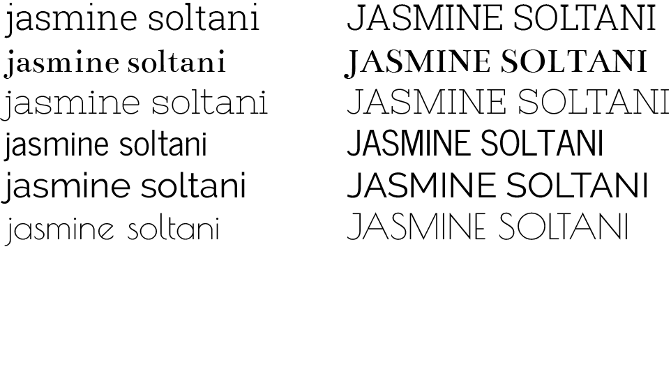
I realized very quickly that I don’t like to see my name in sans serif fonts because I’ve always put a cap on my J… I didn’t consider the cap a serif I was led to believe my whole life that this was part of the letter. I’d also never liked the roundness of the J in cursive and generally don’t like when it descends too far past the baseline. I also found some fonts do strange things with the dots on i’s and j’s, which very important in my name, and eliminated fonts where the dots didn’t seem to align with the rest of the letter. I also assessed fonts based on the distance between the J and A in my first name, finding this is often not uniform (although I did take the opportunity to experiment with kerning in illustrator). I chose to display my name in all lowercase or all uppercase since I’ve come to learn I strongly prefer a lowercase j, but also find it useful to assess the all-caps version.

My name in selected serif fonts:

robotoslab -slab serif, geometric, short shoulder on the r (I would not use this if my name had an R in it)


bentham

-transitional, round terminal on J


nixieone-another slab font, finer stroke, is that a spur on the N?


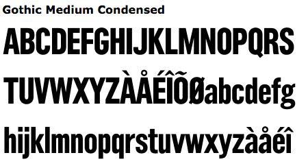
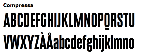
My name in selected sans serif fonts:

newscycle

-grotesque/gothic, uniform weight


raleway

-similar but more oval, more stylized terminals


poiretone

-fine stroke weight, diagonal stress and short finial on e


And all of them together:

jasminesoltani

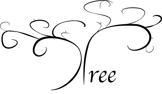
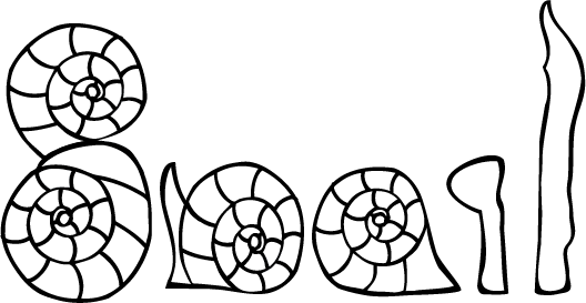
The Word as Image exercise was a great chance for me to learn tools available in illustrator both for creating images and manipulating those found elsewhere.

tree2

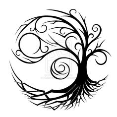
inspired by https://www.pinterest.com/pin/538320961689783780/ and with ‘ree’ in Apple Chancery

tree


snail

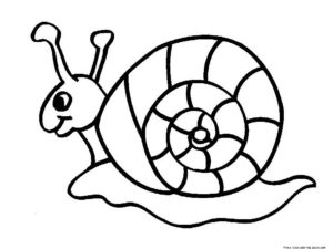
manipulated from image from http://animalia-life.com/coloring/snails-coloring-pages.html
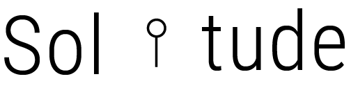
snail


and simply…

solitude

Roboto condensed, and a figure placed to suggest distance.


Electronics Labs

For this week’s electronics lab we worked on learning to use a breadboard, building simple circuits, and providing power to our circuit with an arduino or power supply. I worked with LEDs in series and in parallel, resistors, switches including a soft button I built with conductive fabric, and a motor. I practiced measuring voltage, current, and resistance, and to create a spinning reflective flower, I did a little soldering.

I built the soft button at soft lab. The conductive fabric at the soft lab is conductive on both sides, which I checked with a continuity test. On the inside, there’s a thicker layer of fabric that keeps two pieces of conductive fabric from touching. A small hole in the center of the middle layer allows you to press and make both sides touch. I also played with combining a switch with a potentiometer.

img_1286

Soldering on the bottom of a DC motor – positive and negative only change the direction of the spin

I first tested out the motor with just a key switch and then decided to build a little stand to house it. I soldered the bottom of the motor to wire but didn’t solder together the whole circuit (I am borrowing this button from a friend). I thought having reflective material that moved would create a cool visual effect, so I created this flower controlled with a button. It was actually pretty fun to play with.

sparkly_pic

The final prototype for a spinning reflective flower and a simple button, powered with a 9V power supply

Visual Analysis: Movie Poster

I was looking through old movie posters when I saw this one for Harold and Maude that I hadn’t seen before. I found a different version that also included the sunflower motorcycle in English, but from what I could tell this one and its variations were used for a European audience.

haroldemaude The blocks of text make the poster seem to have a square grid, though could see an argument to be made for one that runs along the lines of the motorcycle. The use of negative space emphasizes the three areas of the poster: the title, the image, and the credits. The background is also subtly given some texture with a paintbrush-like effect in a slightly different tint of dark blue.

The bright colors contrast the dark blue space to draw the eye first to the bright yellow title and the orange-pink sunflower wheels. In terms of hierarchy, the next points of attention are the smaller but also vibrant details: the figures on the motorcycle in red and yellow, then things like the plant riding on the back, the noose around Harold’s neck, Maude’s socks, and “Police” written on the bike. It’s also a compelling and funny image that reflects the zany, dark humor of the movie. Last in the hierarchy are the production credits on the bottom of the poster.

hm_vl-1hm_vl-2

heirarchy

The poster uses two sans serif block fonts: Newhouse (I think condensed and bold) for the title and varying sizes of something like Gothic. I searched around but couldn’t nail down the exact font used here.

screen-shot-2016-09-18-at-6-35-00-pm

Edit: After using alternative methods to try to find the title font, I still found the title font to fit the best. The height of the bar on the A, the shape of the O and U AND D all seem right. Many similar fonts had very different M’s… I could see an argument for the leg of the R perhaps not being quite the same. After spending more time looking at font, the kerning between the U and D in “Maude” and the O and L in “Harold” became quite bothersome.

font

Identifont did help me find a better match for the credit font–no font had the right shape while keeping the legs on the letters short and maintaining the rectangularity of the letters, but the following fonts are at least much closer than Tactic Sans, which I had picked out previously. In analyzing a match, I focused on the D’s, A’s and R’s, but none are are square as those in the poster, which was what made me classify it as similar in the first place. Many similar fonts that I eliminated have even more rounded D’s.
gothic-medium-condensed
compressa

screen-shot-2016-09-18-at-6-34-14-pmscreen-shot-2016-09-18-at-6-34-34-pm

Physical Interaction

What is physical interaction?


A physical interaction is an exchange between a person and and object, or machine, where both are intelligently responding to what is being expressed. A good physical interaction is one where the person can tell, or figure out, how to communicate to the object or machine based on design or cues that the object or machine affords resulting in an exchange that makes sense to the person. Then, the interaction invites continued interaction by being responsive, engaging, and maybe even fun. Chris Crawford included “The first rule in business is that you must identify your basis of competitive advantage and then exploit it to the fullest” in the “Computer’s Basis of Competitive Advantage” section of The Art of Interactive Design, which in this context I immediately translated in my mind to: a good interaction lets people do what they do best while letting a computer do what it does best.


What is the potential?


Bret Victor went even further, giving a sort of urgent, almost moral imperative to push interaction design forward, saying, “…Visions matter. Visions give people a direction and inspire people to act, and a group of inspired people is the most powerful force in the world. If you’re a young person setting off to realize a vision, or an old person setting off to fund one, I really want it to be something worthwhile. Something that genuinely improves how we interact.” This reminded me of Jason Pontin of MIT Technology Review, when reflecting on drones used for warfare he wrote, “Technological advances are not the same as progress.” In a way Victor’s rant was a critique from the opposite end–sometimes achieving some ends are unnecessarily hindered by poor or thoughtless selection of tools. If we want to use technology to progress rather than to stagnate, or worse, regress, then maybe as an extension of this, interactions should facilitate the expression of the best parts of human nature. How can we apply these kinds of principles when we design things?


Non-interactive digital technology


Examples of digital technology that are not interactive could include almost anything that presents information or media, on the web or otherwise, that is not responsive to the person consuming the information. The expected train arrival in the subway, based on the subway schedule or sensors (depending on the city), communicates information digitally, but does not react in any way when people are annoyed or in a rush. In large part the movies, music, text, and art we view online is not interactive, although some online experiences are specifically designed to be interactive. I am not sure if sites like Netflix or Youtube should be considered interactive–I think they are in the sense that they learn about you and make suggestions based on your previous behavior. Maybe this could be considered a conversation about your likes and interests.