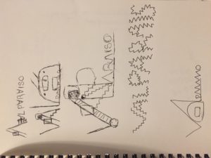
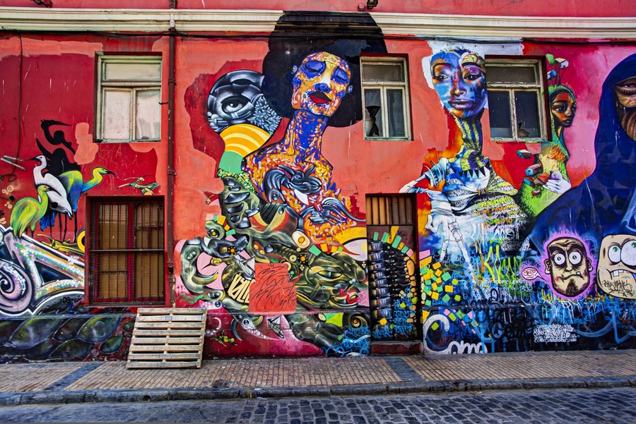
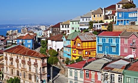
I chose to make a logo for my favorite city in the world: Valparaiso, Chile. My mom is Chilean and my grandmother lived nearby for many years, so I’ve visited several times. It’s a port city that thrived before the Panama Canal was built, and has struggled economically since. It’s distinctiveness comes from being built over several hills. The sidewalks are often steep or simply stairs, and there are several elevators to bring people up and down the biggest hills and the steepest parts. Some are over 100 years old! More recently it has attracted artists and is known for it’s graffiti and bohemian scene.
Current logo

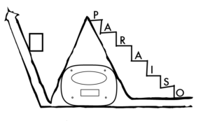
My Logo
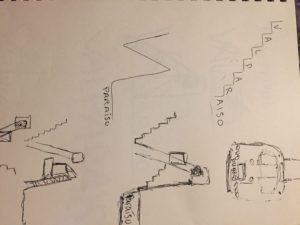
Originally, I purposefully tried to avoid the more expat/bohemian elements of the current culture, and make something that the people there would recognize. I abstracted three iconic parts (which is perhaps already too many) to begin the name of the city, and the rest of the letters lay on the steps. I tried to maintain the expressiveness and color of the current logo. My mom was born there and she understood and was excited by all the essential characteristics, so that seemed good to me. She really loved the steps!
I changed the height of the A based on feedback–it kind of didn’t make logical sense with the rest of the word. I also played with adding trolley cables. Ultimately, I didn’t think this was successful.
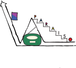
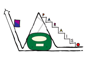
Final version
I slept on it and decided it was just way too much, and created a version where the elements are even further simplified, and got rid of the trolley that was complicating the A. I maintained the elevator and there are tiny steps on the V. The font was actually an accident (I intended to maintain futura, and the smaller text is futura condensed), but after typing it out, I liked the only slightly varying weight of myriad and thought it looked good once I played with the letter height.
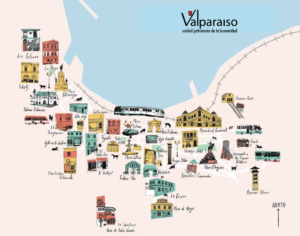
On a tourist map:
Sketches and previous iterations
Iconic aspects of Valparaiso/Source images
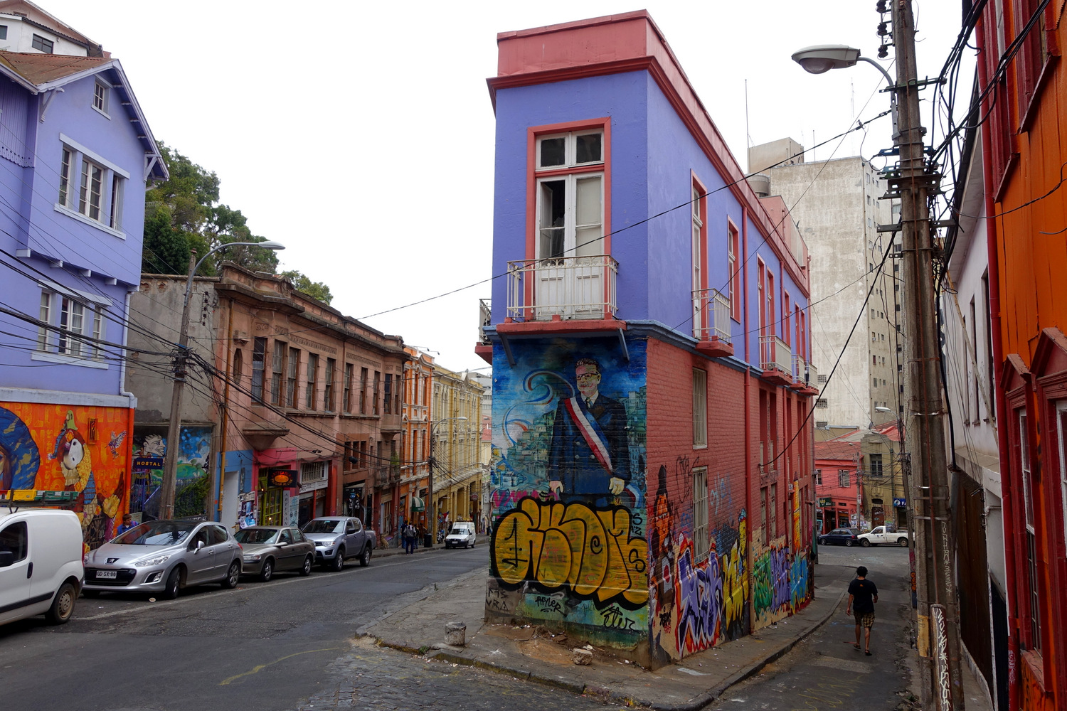
Graffiti



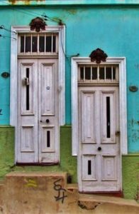
Architecture


Elevators


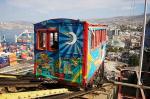

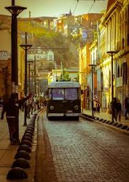
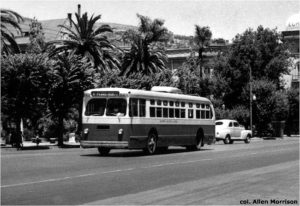
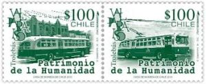
Trolleys
Port: ships, containers, cranes


