Coursework, notes, and progress while attending NYU's Interactive Telecommunications Program (ITP)

Mapping political representation

Link to map.

The democratic primary seems to have sparked a debate about who, Hillary Clinton or Bernie Sanders, is the more feminist candidate. Given the focus on the presidential election, I thought it apt to point out the dearth of women in political positions across the board. The percent of women in the national as well as state legislators hovers around 19-20% on average, which is a pretty abysmal proportion for a demographic that constitutes roughly half of the population.

These percentages represent the percent of women in state legislators (single or lower houses as well as state senates) as of December 2015 according to the National Conference of State Legislatures.

(more…)

Designing a data collection form

For this week’s assignment I designed a form to collect data on people’s sense of personal control, their political leanings, and their faith in institutions. The idea occurred to me as I reflected on Ethan Zuckerman’s talk at ITP where he introduced us to an institutionalist vs. anti-institutionalist schema and discussed how to bring about change in a socio-political climate dominated by this dichotomy. He has also written a related blog post.

I started to wonder how or whether people’s beliefs about how much control they have over their lives related to their belief that they could enact broader change, and whether they desired or expected to do so. One of Zuckerman’s points is that in the U.S., our collective trust in institutions has been declining for decades, and I wondered if people’s place on these spectrums is related to their perceived ability to affect them.

Creating reliable survey items is a complicated process, so I thought I should use questions that came from vetted and tested sources to the extent possible. I used several locus of control questions to understand the extent to which respondents believe individuals can control events that affect them versus being externally controlled, as well as some of the Gallup panel questions on trust in institutions, and a question on political ideology from Survey Monkey’s question bank.

The next step would be testing!

(more…)

Mobile Counting

I created a mobile application version of my desktop counter.

Final mock-up created with Balsamiq

I created an initial version and tested with my co-worker. I envisioned a home screen that would include everything you are counting and icons that indicated accomplishment as well as status bars. Then you could enter each item to increment in the direction that you chose, reset the counter, or delete the item entirely. On each count, you would press down for an animation and when it was complete you’d return to the item’s page where you’d see a change.

New mockup2

First mock-up

The animation and buttons were inspired by a mobile game I enjoy to play a lot, called Spaceteam. To play, you communicate instructions verbally to 1-3 other players, in order to keep your ship safe on its journey. For a simple counting application, I thought something like the button you press in the waiting room might be effective–it lights up and your player beams a laser into the air. To start the game, all the players must be holding down the button at the same time.

Screen Shot 2016-02-15 at 12.26.26 AM  Spaceteam

I created progress bar animations to further demonstrate the idea. One goes forward, for incrementing up, and the other goes backwards, for incrementing down (code on github).

(more…)

Maintaining autonomy in mobs

This week in class we analyzed the process through which crowds turn into mobs with the Iranian Green Revolution as our main case study. We developed a conceptual solution for a peaceful protester, whose main interest is safe political expression.

(more…)

Maps: Troubleshooting

For this week’s assignment I added a layer of US State data to a Stamen base map and after a lot of compromising, simply added markers for landmarks I associate with voting and politics near my parent’s house. Even as I simplified my map goal, I kept running into issues. At 3am, maki markers don’t work. At the least this theme of personal reference points carries over from last week’s assignment? I’m consistent! And I think learning to make things look better.

Screen Shot 2016-02-12 at 9.10.08 AM

No errors but the code isn’t doing what I asked

(more…)

Desktop Counting

This week’s assignment was to create a device that can sit on a desktop and account for single increments of change, counting either up or down. Our clients are people with desk jobs, who want a physical reminder of their progress. Having a full-time desk job, I am fully cognizant of the despair of an office environment, so I also considered what might be fun, pleasant, and satisfying, while also somewhat conservative to suit different office environments.

IMG_0481

abracazebra’s favorite mug

IMG_0479

This instagrammer reminded me of perpetual calendars, which I love because their aesthetic as well as their cleverness


IMG_0489

My coworker’s desk: snacks, succulents, photos, a mug, among other “office supplies”

Screen Shot 2016-02-09 at 10.31.44 PM

Perpetual calendar from wikipedia


I looked around my office, went on instagram, I surveyed my coworkers, and googled to gather data on what people’s favorite desk-things are. I found that people love their plants and mugs. I also found that the hashtags #desk#mydesk, and their variations have a surprisingly large number of posts. And I found out what Marissa Meyer and Mark Zuckerberg keep on their desks. I personally do not have a favorite desk item, although my favorite thing in my vicinity used to be my polar bear calendar (cute, bleak, and functional, like me).

Inspired by the simplicity and cleverness of perpetual calendars and hourglasses, I tried to come up with counting devices that might mimic this kind of interaction while serving a counting function. I also liked the idea that the device could stay analog, requiring no batteries or any other annoying maintenance.

IMG_0509

Could it work like a roladex or hourglass?

IMG_0508

Perhaps the device could flip to cue counting up or down, or twist to increment


(more…)

A Favorite Object/A Frustrating Experience

My backpack

I feel bad because I abuse my backpack. It must be 3-4 years old but don’t think I’ve ever washed it. I used it almost every day. I remember my original motivation was to stop using a bag where heavy things strain just one side of my body. Once my coworker told me it made me look like an eighth grader which made me stop using it for a while but I don’t care anymore because it’s still the best way to carry things around a city.

IMG_0449

Cute af

My backpack is the perfect size for the things I regularly carry. My laptop, notebooks, and books are flat or square and can go securely in the stretchy inside-pocket. Smaller things can go in the small outside pocket. I usually have hair ties, burt’s bees, mascara, a cereal bar, and/or business cards in there. Everything else fits in the larger space: more books, a sweater, a pencil case, a flask, etc. I am a messy person but nothing gets lost. I think I could thrive and remain entertained for 2-3 days on its contents.

I can hold any strap while standing on the subway and it won’t touch the floor. This is great because I probably still wouldn’t wash it. The zippers are awesome. The color block is good for helping people understand I am not indie-goth despite my perpetually black outfits.

Torture-device turnstiles

I hate these subway turnstiles. They are scary to look at because they seem capable of squishing humans into 20 pieces. When I googled them I found out they are informally called “iron maiden” turnstiles, after the torture device, which makes sense to me.

People take forever entering and leaving them because if you swipe and walk at a normal speed you miss the inevitable indication to swipe again (why aren’t there audibly different sounds for a successful versus failed swipe?). There’s often a line getting on the N/R at NYU because of this. If you have a large bag or a long gait you are screwed. If you push incorrectly, you can easily lose your swipe (which apparently happens very often). At the Parkside Avenue Q station there is an exit with an iron maiden turnstile and an emergency exit. Everyone uses the emergency exit.

IMG_0444

Getting on the G train inspires my ire

(more…)

F3EA: Find, Fix, Finish, Exploit, Analyze

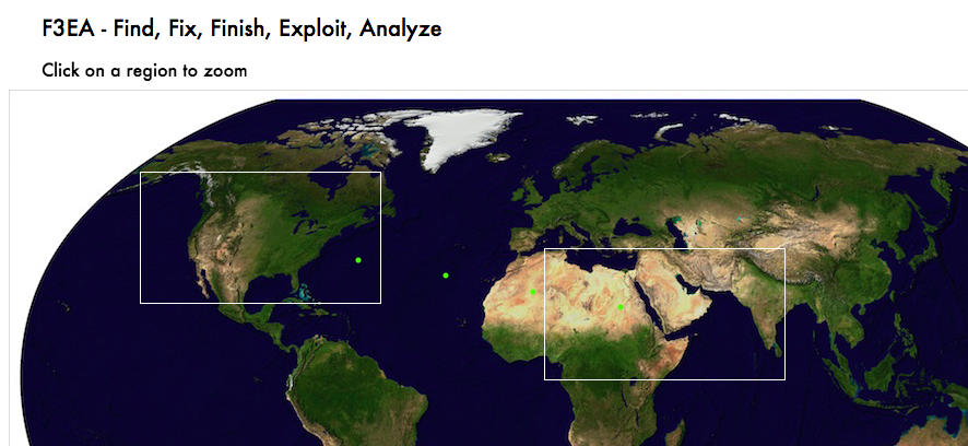
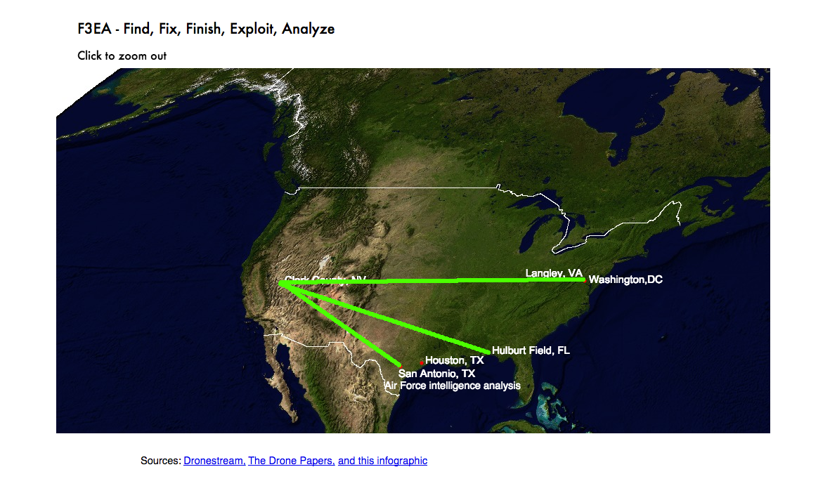
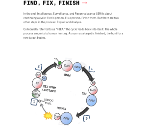
My final project, F3EA: Find, Fix, Finish, Exploit, Analyze is online here. And my source code is available here.

An introduction page gives a recent history and some background to the project. Viewers can click anywhere to continue to the main page, an animation of how information flows from drones used for surveillance, signals intelligence, and strikes in the middle east and north Africa through military bases all over the region to the United States. In the United States, communications between drone pilots, analysts, and political leaders in Washington is also shown. Mousing over different symbols displays more detailed information for each leg of the journey, and explains how information gathered is used to decide and then carry out strikes. Click-zoom allows you to focus on the United States, the middle east and north Africa, or the whole world.

Information design inspiration

When I originally proposed this project, I looked for artists that did work related to drones. A lot of the work I found was drone photography, almost all of which had some kind of imagery or posed some thoughtful question that influenced the way I chose to depict the world. But particularly on a map, symbols become very important, and there were a few pieces of journalism that included smart design that I referred to a lot.

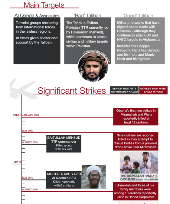
I think the Bureau of Investigative Journalism often does a great job incorporating text with visual information that also gives context and sense of time.

Timeline - The Bureau of Investigative Journalism

Timeline – The Bureau of Investigative Journalism

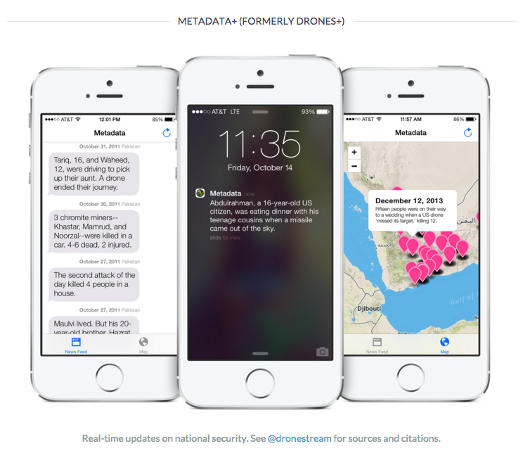
Josh Begley, whose work inspired this whole line of inquiry, also worked on a visual glossary for the Intercept’s recent report, The Drone Papers.

Visual Glossary from The Drone Papers

Visual Glossary from The Drone Papers

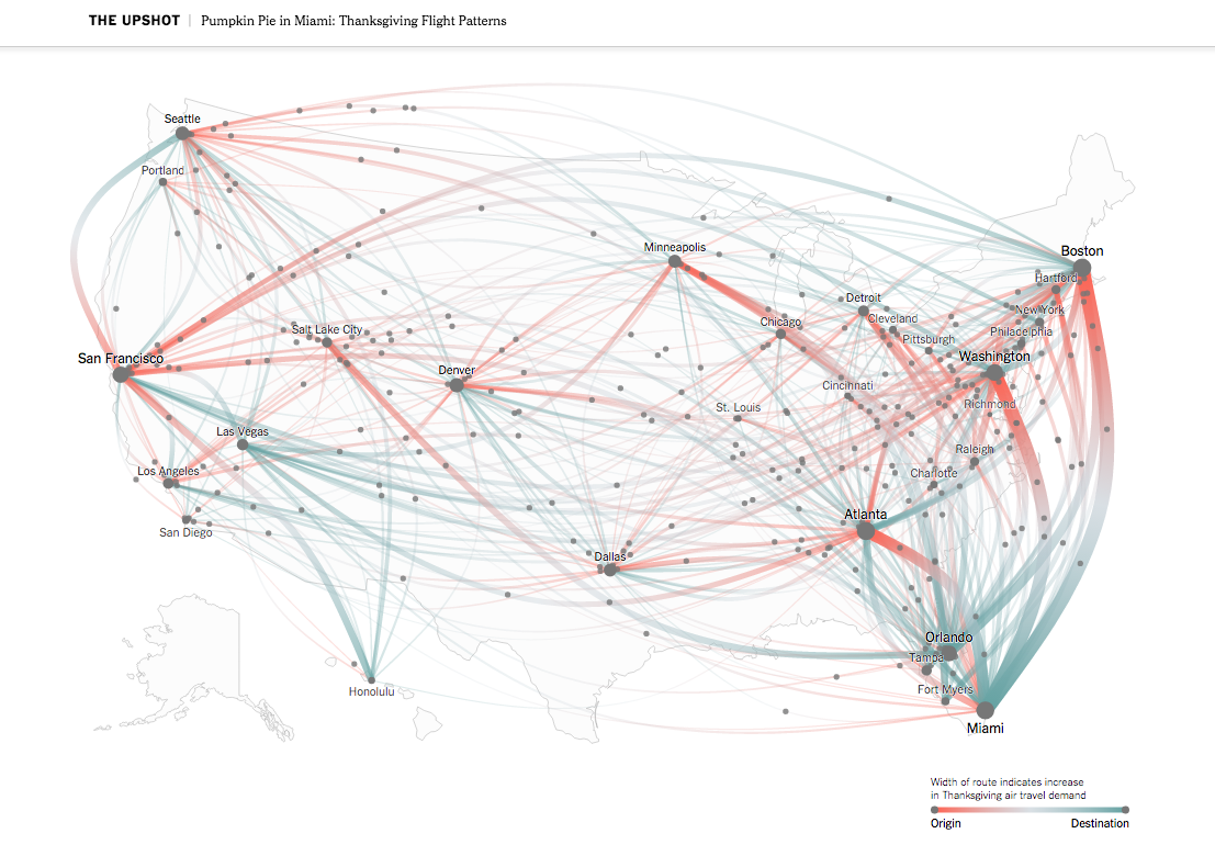
Unrelated but cool was this visualization of Thanksgiving travel in the New York Times. I thought this was a great way to depict movement.

Screen Shot 2015-12-03 at 9.08.51 AM

New York Times shows Thanksgiving travel

(more…)

Final Project: Prototype

After a week at looking at maps made with D3.js and watching Lynda videos on D3 and HTML, my prototype for my final project is done entirely in P5.js. I realized my inexperience with HTML and CSS meant getting past the learning curve would take longer than a week. But, I think I will be able to test the functionalities of my final product with my first prototype.

I’d like to be able to use an actual map in order to use coordinates, and the entire sketch is missing a lot of information that I’ve been organizing separately, from various sources. I have a long list of improvements, and questions about integrating DOM elements, P5.js and D3.js.

Screen Shot 2015-11-19 at 12.36.15 AM

Mousing over cities reveals text created with p5.dom.js, but this messes with my animation

(more…)

A Visualization of the Drone Strike Target Process

Final Project Proposal: A Visualization of the Drone Strike Target Process

Either a map or globe will be displayed, with a line or crosshair that follows the flow of information from intelligence gathering in countries where the U.S. wages covert war, to facilities in the U.S. used for surveillance, to decision making in Washington that lead to drone strikes. Starting the interaction will put a timeline in play (where a year might be 30 seconds or a minute, for instance), and you will be able to move across to globe to these two distant regions.

After initially doing a project on drone strike deaths, I became less interested in the idea of quantifying deaths. As long as history has existed, governments and people have fought wars, and death from warfare is expected. It was hard for me to put deaths from drones in context because I think there could be a valid argument that using drones has resulted in less casualties than would have resulted from traditional warfare. But, drone strikes in countries where we haven’t declared war mean these strikes are effectively assassinations. Even assuming complete cooperation with host countries and congressional approval (many would argue congress has exercised minimal oversight) there are still major ethical and legal problems related to the process of targeted killing.

After my first project I looked at other work by Josh Begley, the data artist that most inspired my exploration into the topic of drone strikes and creator of Dronestream and Metadata+. He also contributed to The Intercept’s The Drone Papers and contributes to Geographical Imaginations, a blog on law, space, and security.

Metadata+ was recently pulled from the Apple Store

Metadata+ was recently pulled from the Apple Store

One post back in April included an infographic of the Kill Chain by a journalist, Alissa Scheller. It showed surveillance, intelligence work, and drone piloting carried out in the U.S. alongside drone activity and intelligence gathering that happens in the Middle East.

The Kill Chain, Alissa Scheller

(more…)