Final Project Proposal: A Visualization of the Drone Strike Target Process
Either a map or globe will be displayed, with a line or crosshair that follows the flow of information from intelligence gathering in countries where the U.S. wages covert war, to facilities in the U.S. used for surveillance, to decision making in Washington that lead to drone strikes. Starting the interaction will put a timeline in play (where a year might be 30 seconds or a minute, for instance), and you will be able to move across to globe to these two distant regions.
After initially doing a project on drone strike deaths, I became less interested in the idea of quantifying deaths. As long as history has existed, governments and people have fought wars, and death from warfare is expected. It was hard for me to put deaths from drones in context because I think there could be a valid argument that using drones has resulted in less casualties than would have resulted from traditional warfare. But, drone strikes in countries where we haven’t declared war mean these strikes are effectively assassinations. Even assuming complete cooperation with host countries and congressional approval (many would argue congress has exercised minimal oversight) there are still major ethical and legal problems related to the process of targeted killing.
After my first project I looked at other work by Josh Begley, the data artist that most inspired my exploration into the topic of drone strikes and creator of Dronestream and Metadata+. He also contributed to The Intercept’s The Drone Papers and contributes to Geographical Imaginations, a blog on law, space, and security.
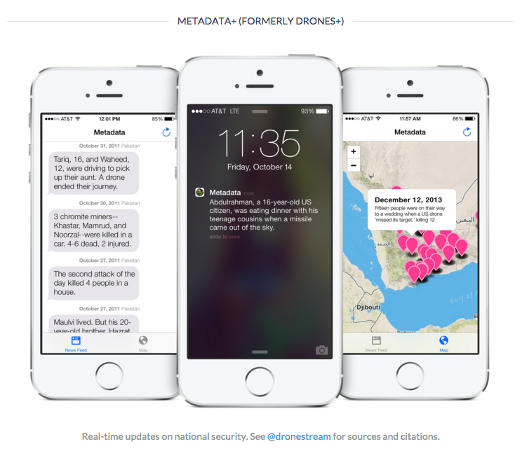
Metadata+ was recently pulled from the Apple Store
One post back in April included an infographic of the Kill Chain by a journalist, Alissa Scheller. It showed surveillance, intelligence work, and drone piloting carried out in the U.S. alongside drone activity and intelligence gathering that happens in the Middle East.
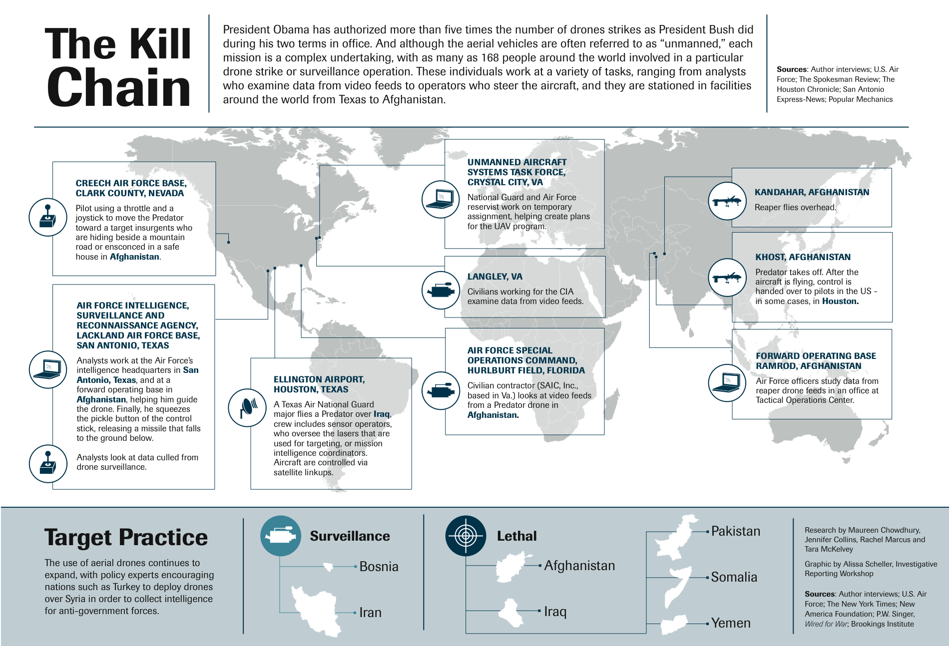
The Kill Chain, Alissa Scheller
I thought this was really interesting but there was no temporal aspect, so I had trouble understanding how the pieces fit together. Of course, this was also created before the recent document dump. I would like to do something similar, but with new information about the process that came out of The Drone Papers documents. Some figures included in these documents that could be incorporated to make something like the infographic above more robust:

Figure from The Drone Papers shows intelligence data sources
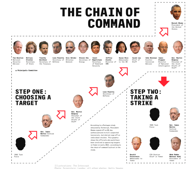
Figure from The Drone Papers shows the people in the process for the approval of an attack
Other Inspirations
Trevor Paglen is a photographer whose work is often related to surveillance themes. One piece, Drone Vision, is actually an intercepted image from a surveillance drone. This was interesting in terms of its unsurprising aesthetic–it’s exactly as you’d imagine an image from a drone to look, and made me think of the widely understood symbol of the crosshair (also in the infographic above).

Drone Vision, Trevor Paglen
Tomas Van Houtryve is a photographer who has created aerial photographs using drones. For his project, Blue Sky Days, he “travelled across America to photograph the very sorts of gatherings that have become habitual targets for foreign air strikes—weddings, funerals, groups of people praying or exercising.” In a schematic, this would constitute intelligence gathering and targeting if it took place in a target country.

Suspect Behavior, Tomas van Houtryve
Wafaa Bilal did a 24-hour performance piece where he had “his back tattooed with a borderless map of Iraq covered with one dot for each Iraqi and American casualty near the cities where they fell” as well as 100,000 Iraqi casualties. I am drawn to this physical potential for data visualization (unfortunately, I’m not taking PCom this semester), and am intrigued by this unique map. This made me reflect on the political boundaries we always present on maps, sometimes unnecessarily and unquestioningly. I wonder if we would start to understand our relationship between ourselves and the distant wars and assassinations differently with them erased.

…and Counting:, Wafaa Bilal
Other ideas and questions
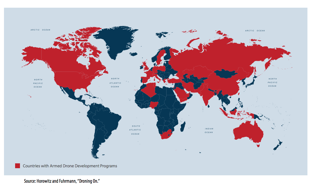
There’s some data on countries that have been open about their drone development programs
- I really want to explore data visualization while at ITP but there isn’t good drone data–I think there is plenty of other information about drones to present in this project. I wonder though, if I should try to incorporate any other information about drone proliferation? There are also other autonomous or semi-autonomous weapons, like land mines and missiles, as well as military budgets, which you could relate to the accumulation of weapons. Is this worth thinking about/exploring? Is that too much, or out of scope?
- What tools should I use? I’d like to learn more about the D3.js and Three.js libraries but I’m not sure what else should be on my radar. What’s good for presenting geographic information?
- There are important themes I’d like to be apparent in the project: the opacity of the policy, the lack of friction and perceived accuracy in robotic warfare, the physical distance between decision-makers & drone operators and the victims of strikes. Will this come across?
- I couldn’t get away from this idea because I just kept reading about drones–I started to feel inundated with research and all the articles and stories from victim’s families. I spent a lot of time reading and I wonder if there are important artists that do work related to drone warfare that I missed?